CHAPTER 4 Stage 2: Rapid Prototyping
This chapter describes the second stage in the development of the AVSA - rapid prototyping. Our goal here was to develop a system as quickly as possible to prove our concept and so that we could obtain user feedback that could be used in the development of subsequent iterations and more complete versions of the system.
4.1 Ingredients
The first task was to gather, based on the choices made in chapter 3, all the technology which we needed to build the system- the ingredients. The ingredients were subdivided into three main categories- the hardware, software and last, but not least, developers. In accordance with the goal of this stage we first looked at what was immediately available to us and then what could easily be acquired.
4.1.1 Hardware
We identified the following hardware requirements.:
- a video overlay board that accepts an external NTSC video signal and an internal computer generated signal. The composite of these images must be accessible externally as an NTSC signal.
- a sound processing board that accepts an external analog audio signal.
- a network interface card.
- a computer to combine all of the components and on which the system is to reside.
- access port to the local area network (LAN).
- appropriate audio and video connections between the visitor and the media space.
4.1.2 Software
The following software requirements were identified:
- video overlay software and application programming interface (API).
- automatic speech recognition (ASR) software and API.
- network interface software.
- software developer toolkits on which to build the interface, the translator and communication utilities and in which to integrate the video overlay, speech recognition and network technologies.
4.1.3 Developers and reviewers
As previously mentioned, the interface is the most important component of the system. Careful consideration has already been taken in the choosing the technologies to be used. To ensure that our system is developed with the user in mind we decided that the system should be developed by people with as diverse a background as possible. We should have people who have never used this type of technology before, people who have used this type of technology, and people from different fields and levels of education. We also realized that it is not always possible to cover all the basis, therefore we decided that after successive iterations users should be brought in to test the system and/or review our design and system.
4.2 Recipe
The process of building the system is as follows (testing all hardware and software as required):
- choose, gather, install the appropriate ingredients.
- connect the AVSA to the media space through the audio and video links.
- connect the AVSA to the Ethernet.
- build TCP/IP communication subsystem to communicate control information via the Ethernet.
- specify communication protocol for communication between the AVSA and the media space. Alter the media space so that it conforms to this new protocol.
- develop the translator based on the communication protocol.
- integrate the ASR.
- develop the interface.
4.3 Preparation
The following sections discuss the actual preparation of the prototype AVSA based on the recipe laid out in Section 4.2.
4.3.1 The hardware and software
After considering all the options available to us we decided to develop the prototype on the personal computer platform. We acquired an IBM PC clone running Microsoft Windows 3.1 to be the dedicated server.
We obtained and installed a video overlay board produced by Roctec Electronics Limited called RocGen VGA. The overlay hardware came with a device driver and API to allow us to integrate it into the system.
For the sound aspect of the system we decided to use a Sound Blaster 16 card to process the audio signal and a speech recognition software called Voice Assist that was developed by Creative Technology Limited.
To connect to the Ethernet (our LAN) we obtained a network interface card by 3Com Corporation as well as their device drivers. A shareware PC-NFS (network file system) software to allow the PC to access the UNIX system files that were crucial to the system was also acquired. The Windows Sockets API (WinSock API) was also obtained to allow us to build communication utilities for the windows application.
To build and integrate all the components we planned to use Microsoft's Visual C++ (MSVC) programming environment and Windows Software Development Kit (SDK).
4.3.2 The development team
The development team we gathered consisted of:
- William Buxton - A musician and expert in the field of user interface design. Professor Buxton introduced the idea of the AVSA and was to play an active role in reviewing the system and, as a user of the former system, coordinate requirements with other users.
- Koichiro Tanikoshi - A visiting scientist from Hitachi Research Laboratory in Japan. Koichiro brought many years of experience in the field of human-computer interaction (HCI) to the team. His role in the project was to initiate development on the hyperdoorway (the system which was eventually developed into the AVSA).
- Anuj Gujar - An HCI graduate student whose past experiences included a specialization in software systems. His role was to take an active part in the development of the hyperdoorway and to supervise and develop the AVSA.
- Shahir Daya - An electrical engineering undergraduate student. His role was to aid in the development of the utilities that allowed communication to the media space and the eventual interface for the AVSA.
- Jeremy Cooperstock - An HCI graduate student with the departments of Electrical Engineering and Computer Science. Involved in the initial start-up of the AVSA Jeremy's main role was to help customize specialized media space services for the AVSA.
- Tracy Narine - Administrator for the iiif system. His role was to help integrate the AVSA into the local media space.
- Radek Nowicki - An undergraduate student with the department of Computer Science. His role was to aid in the initial stages of developing the interface.
- Don-Jun Wang - An undergraduate student with the electrical engineering department. His role was to help in the initial stages of developing the communication utilities.
From this list it is clear that we accomplished our requirement of obtaining developers from various backgrounds. We had people new to the technology, people familiar with the technology and people of varying levels of education. We were confident that by using this team we could obtain user feedback while developing the system thus minimizing the impact of the user feedback which will be obtained when the prototype is completed.
4.3.3 Linking to the Media space
The first task to be done was to register the AVSA with the media space. By registering, we were updating a database to tell the media space that there is a device named av-server and which four wires (2 audio and 2 video) will hook the AVSA into the media space. Once registered, the appropriate wires had to be run to the PC for hook up.
A default connection to the AVSA was also set up. So that when a visitor connects to our CODEC they will see whatever interface the AVSA wants them to see. In the initial stages this display was a view from a camera pointing at an appropriate sign. Scripts were also written to allow the AVSA to tell the media space when and how to connect an electronic visitor to a room within the media space through the AVSA.
The second task was to install the Ethernet card and install the drivers. Then the LAN had to be informed of the new machine. The NFS software was also installed to allow UNIX directories containing crucial media space information to be mounted on the PC.
4.3.4 Sending requests to the media space
The next step was to build communication utilities to allow the AVSA to send and receive control information to/from the media space from/to the PC. These utilities had to be compatible with the communication protocol of the media space communication utilities. We use the WinSock API network programming interface to develop these utilities. It is based on the "socket" paradigm popularized by the Berkeley Software Distribution of UNIX.
These utilities, which came to be known as the hyperdoorway system, allowed the AVSA to send requests to background processes of the media space and receive responses from the background processes based on these requests.
4.3.5 Querying the media space
The replies that were being received by the hyperdoorway system were not formatted in any uniform way. In actual fact the replies were confirmations that the request had been processed. To the hyperdoorway they were meaningless and useless pieces of information. The system we wanted had to be able to process the replies into meaningful pieces of information so that further request could be made of the media space. It was at this point that the AVSA was born. By negotiating a protocol with a developer of the other media space components, Jeremy Cooperstock, we came up with a simple protocol by which the AVSA should communicate.
How does it work?
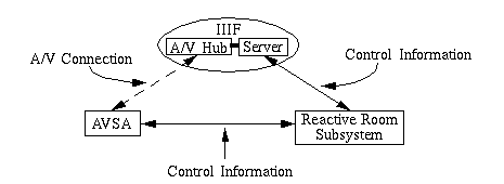
The media space consists of two main systems. The first was the IIIF and the second was the reactive room[Cooperstock et al 1995]. The IIIF is a software/hardware system enabling one to make connections between members of the media space. The reactive room consisted of a hardware/software sub-system that allowed one to control A/V resources within a room. The reactive room subsystem has the ability to communicate with the IIIF. Since we were trying to complete this stage quickly, we decided that we should speed up the prototype process by dealing with just the reactive room and communicate with the IIIF through it (Figure 13). A translator was then built into the AVSA to parse information, based on the established protocol, into appropriate data structures.
The basic communication is as follows:
- The AVSA talks to the IIIF via a reactive room daemon called the telepresence (TP) daemon (tp_daemon)
- The AVSA talks to the reactive room through a system of daemons, that are a part of the reactive room subsystem, to control the reactive room's resources.

Figure 13: The AVSA talks to the IIIF through the reactive room subsystem.
4.3.6 Integrating the ASR
The ASR we were using did not have an API. Once the ASR was initiated the application which was active was the one acted upon. For our purposes this application is always the AVSA. All audio will go through the ASR. When the ASR recognizes a word, it maps that word into a corresponding keyboard press. The translator was coded to recognize this keyboard press, access the appropriate information to send to the media space and then, through the communication component, send the information.
4.3.7 The first interface
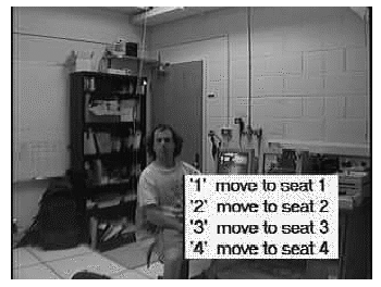
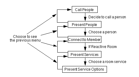
Since the interface is a layer independent of the communication layer, the first AVSA interface was developed as part of the hyperdooway system in parallel to the communication component. It presented a hard coded list of captions in a box at the bottom right section of the screen as a textual list descriptions preceded by a number (Figure 14). The idea was that the visitor would say the number. If the ASR recognized a number, the command associated with that keypress was sent to the media space. As the translator and communication protocol of the AVSA system were developed a menu hierarchy (Figure 15) was formed through which a visitor could traverse and access services. The services were no longer hard coded as the media space was queried for services at each level.

Figure 14: This view of the first interface shows the options available to a visitor who has chosen a reactive room service allowing them to move to a different seat.

Figure 15: A schematic of the menu hierarchy.
The hierarchy of services
When a visitor calls a media space's CODEC, the AVSA presents the visitor with the option of calling a member of the media space. If the visitor says they wish to call someone, the AVSA asks the IIIF who they may connect to and then presents these options to the visitor. When the visitor chooses to connect to a member, the AVSA instructs the IIIF to make an A/V connection between the visitor and the member. At this point an option is presented to allow the visitor to disconnect from the member's space. If the member happens to be the reactive room, the reactive room daemons are queried for services. If services exist they are presented. Some services will have further options which are displayed when and if the service is chosen.
At this point the basic system had been developed and we decided to take a step back and look at how we could improve the actual interface.
4.4 Enhancements
In improving the interface we went through several iterations. At the end of each iteration we obtained input from members of the IRG and/or the development team. This input helped us make decisions on how to improve the system for successive iterations. The evaluation was done informally by exposing the system to the user group and noting their comments. Approximately twelve people were involved in the evaluation leading to the enhancements discussed in this section.
We explored two different ways of improving the interface. The first was to use a more descriptive interface making it more self-explanatory. The second was to improve the textual interface to make it more effective. The following sections describe the enhancements and iterations which we implemented.
4.4.1 A more descriptive interface
With the text interface we observed that it was not always apparent to the visitor what would happen if they chose an option. For example, in the reactive room if the visitor chose the service seat changing they were presented with the textual list of different virtual seats to which they could move allowing them the ability to get a view of the room more appropriate to their social role[Gujar et al 1995]. This list did not tell the visitor anything about what they would see when they moved to that seat. The visitor would have to go through a trial and error process to get acquainted with the room.
First iteration
Our first impression was to provide a more descriptive caption for the options. So instead of the captions "Move to seat one, Move to seat 2, Move to seat 3......", the visitor would see "View the blackboard, View the door, View the Mac....". This certainly was more descriptive. However it was also very limiting. What if two things could be seen from a particular seat? Would the caption have to include both objects? What if two seats provided a view of the same object? How would we provide a description that allowed the visitor to choose the best one for their purposes? How could the description be updated to reflect a change in the position of the seat? Some cameras in the media space are motorized to allow them to pan through the room. How would the description be updated to reflect these changes? We also had to keep the descriptions as short as possible so that the interface did not become too intrusive.
We decided that a textual list was not the way to add description. Instead graphical symbols may be more appropriate.
Second iteration
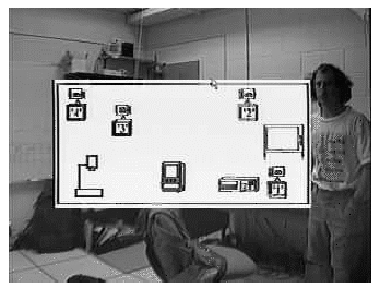
Our first attempt at adding a more graphical interface was to generate an image file containing a map of the room with its objects labelled. This image was displayed when the visitor chose to access the seat changing service (Figure 16). Now the visitor could visualize what they would see if they moved to a particular seat. The need for lengthy descriptions was eliminated. Unfortunately, there were still problems with this interface. How would the image map be updated to reflect changes in seat position? How does the visitor know which seat will give them the best view of non-static objects such as people.

Figure 16: Using the floor plan to facilitate orientarion.
Third Iteration
The third iteration added snapshots to the interface, updated every n seconds, containing views from each seat (Figure 17). This solved most of the problems of the first two iterations. Lengthy descriptions were no longer required and the visitor got up to date views from each camera.
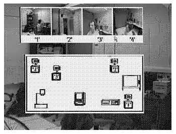
Figure 17: Snapshots (the four smaller images at the top) provided enough information to eliminate trial error and lengthy descriptions, but the interface is now too intrusive.
Unfortunately, much of the view of the media space is obstructed by the interface making it intrusive. We could not decrease the size of the images either because, as mentioned before, the CODEC degrades the quality images. Smaller images would be useless for their intended purpose to the visitor. We also observe that as the number of options increase more and more space would be used by the interface making it increasingly intrusive.
Another potential problem was that by eliminating the textual description we were risking the possibility that a user may not understand the purpose of the interface.
In addition, one of our goals in developing the AVSA was to make it as flexible as possible so that it could be integrated into any environment. The type of customizations we have described require a static environment. These customizations can be worked out for a particular media space when and if required.
Based on the above problems, we decided that improving the interface through a more graphical approach was not the correct path to follow. Therefore, we turned our focus to developing a more generalized system through a text interface.
4.4.2 Improving the text interface
Having decided that the generalized text interface was the style of interface that we should improve, we looked at the deficiencies of the original interface described in Section 4.3.7.
Feedback
The first deficiency was that of feedback. Our initial thought was that since all of the actions resulted in some visual and/or audio shift we would not require any extra feedback. This, however, was not the case. Users wanted to see what word was recognized (incorrectly or correctly) by the ASR. Users wanted some indication as to what action was being performed. Users wanted to know if the action had failed.
To provide this information we decided to implement the banner. The banner was a one line description of text displayed at the top of the screen (Figure 18). It told the user what action was being performed and if the action was successful or not. The ASR we were dealing with did not have an API so we could not provide this information to the AVSA to be displayed in the banner. Instead we overlaid the ASR's GUI on top of the video image. This GUI showed activities of the ASR sufficiently enough to provide the feedback which we required.

Figure 18: The banner, at the top of the screen, provides feedback indicating,for example, what was chosen.
How do I direct my speech?
One of the difficulties with using speech as an input mechanism and the medium through which to communicate with members of the media space is the issue of how the AVSA knows when the speech is directed at it and when it is not directed at it. When we first designed the interface we decided that after a certain time-out period (about 10 seconds after the last command seemed to work well) the list of options would disappear. Any time the options were not visible, the AVSA would not perform any actions. The only way to activate the AVSA again was to bring the menu up again by uttering the words "show menu". This mechanism made it easy for the system to recognize if the visitor was talking to the AVSA or to someone in the media space. It is similar to the protocol used in the popular television show Star Trek (i.e. instead of "computer").
There were some problems with this mechanism for our case. Unlike Star Trek's computer, today's technology lends the AVSA limited ability to understand the user. Therefore we cannot realistically design the system so that the user can converse with the AVSA as if talking to a real person. Relatively few commands are available. This is the reason we display available options through visual prompts. By fixing a time before which the menu will not disappear we are introducing a situation in which it is possible that the AVSA will not know who the visitor is talking to. For example, if the visitor connects to the media space, they do not want to wait fifteen, ten or even five seconds before they start their conversation. One solution would be to simply make the menu disappear as soon the AVSA completes an action. The problem with this solution is that there are several cases in which the visitor will be travelling two or three levels into the menu structure before wanting to converse with a member of the media space. It would not be appropriate to require the visitor to say "show menu" at each level. Our solution is to provide a "hide menu" command that will allow the visitor to remove the menu from the display indicating to the AVSA that the visitor is now speaking to members of the media space instead of the AVSA.
Option Scrolling
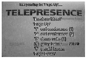
There were a number of cases in which the number options that were available was very large. For example, the video cassette recorder (VCR) had a list of fifteen possible control options. In this case displaying all the options on the screen would occupy the whole screen and make the interface too intrusive. As a result, a scrolling system was implemented. We set a limit of five control options at any time plus page up, page down and previous menu (Figure 19). Page up would display the next five options. Page down would display the previous five options. If there were five or more options available, five options were displayed at all times. For example, if there were eight options. Options 1-5 would be initially displayed. When visitors indicated that they wished to scroll down options 4-8 would be displayed not just 6-8. This ensured that we maximized the number of options that the visitor could access at any one time.

Figure 19: Page up and page down commands are used to scroll through the menu.
The background box
Another deficiency was that of the general appearance of the visual prompts. First, all the options were displayed in a solid box. Also, the text of the feedback banner was contained in a solid box. We felt that this emphasized the presence of the list too much. We wished to make it more subtle. As a result, we decided to eliminate the box and just display the text captions with the associated command to be uttered.
The text
By removing the background box we had created another problem. The text, which was displayed as solid black, was invisible or barely visible in some situations. For example when the option list happened to be overlaid on top of a black desk, or when the banner was displayed in a very dark area of the view (usually due to lack of light and/or a dark colored ceiling).
We decided that the best way to deal with these problems was to adopt a technique used in the television/movie industry. The text would be displayed as two colors. One color outlining the other. We experimented with various colors. Some colors did not offer enough contrast. Some colors bled when passed through the CODEC. Some were simply not appealing. The combination that worked the best was white text outlined with black. Our conclusion regarding the colors was supported by the television/movie industries who frequently use this combination of colors for close captioning.
Static and dynamic options
Options were presented as a number followed by the caption describing the result of choosing that option. As described earlier this was done to maximize the accuracy of the ASR. Some users remarked that by restricting the user in this manner we were actually diminishing the relevance of using speech to make the interface natural. We took a closer look at the interface. As a result, we realized that the options previous menu, page down and page up were actually static options. That is, they either appeared or did not appear on each menu. Therefore we should still be able to reach high levels of accuracy by requiring the visitor to say the actual action instead of the number associated with that action. As a result, these three static actions were invoked by uttering their caption instead of a number that corresponded to their action.
The Commands
Another problem with the interface was in the way the commands relating to the options were presented. It was not clear what part of the list was to be uttered to invoke the command. This problem was compounded by the addition of static and dynamic options.
We decided that a simple self-explanatory indicator would rectify this situation. As a result we borrowed a convention used in literature to signify speech. We decided to represent the utterable words enclosed in quotes. This proved to be a very effective way of representing the utterable commands.
4.5 User impressions
We were now at a point where the AVSA had been developed sufficiently enough to show it to a larger group of people in order to obtain their comments on:
- how useful they think the system is
- what could be changed or added to further improve the system
Although it was not plausible to perform any formal user evaluation, we were able to learn a lot from the comments of people who informally reviewed and tested the system. Thirteen people reviewed the design of the system and were exposed to the system. Nine of these people rated their expertise on a scale of 1 to 5 (5 meaning an expert in the area) in this area of work. Three rated themselves as 5, four rated themselves as 4 and two rated themselves as 3 on the scale. The other four reviewers did not rate themselves, but said were moderately familiar with videoconferencing systems. Another set of ten people from the IRG, the development team and the DGP lab observed and/or used the system in an informal setting to provide even more information regarding the functionality and usability of the system.
4.5.1 The concept
The immediate reaction of most people who saw the system was very positive. They were very interested in the concept and its contribution to media space accessibility. In addition, from our own experiences in using the system and comparing it to the previous situation it was quite obvious that we were on the correct path.
4.5.2 The system
The system itself was also quite well received by the people we questioned. One regular user commented that if the ASR was more accurate they would prefer this interface to the TP application.
Despite the obvious optimism, they did suggest some changes to the interface to improve their ability to navigate through the menu structure. Our experience and observations of them using the system also gave us ideas on how to improve the system.
One of the major shortfalls of the system was the ASR. The ASR which we had obtained was a beta version which was given to us. As such its performance was not as good as an ASR should be for our type of system. We required a very high rate of accuracy (95% or more). We were only achieving approximately 80% accuracy with a speaker-dependent ASR. It was clear that if our system was to be deployed into the field we would have to carefully choose an appropriate ASR.
4.6 Summary
This chapter described the development of a prototype AVSA from gathering the ingredients of the system, planning how to put it together, actually building the system, revising the system based on evaluators' comments and then obtaining further comments to be integrated during the next stage of development of the AVSA. Based on these comments we learned that users accept the concept of the system and the system itself. There were two major criticisms of the system. First was that the ASR was not performing at a level that was acceptable for the needs of our system. Second, the PC system was very unreliable.
Contents
